The Psychology Behind Colour in Commercial Interiors
Colour is one of the most powerful tools in commercial interior design.
It shapes how people feel the moment they walk into a space, influences the way they behave, and even impacts decision making, productivity and wellbeing.
Far beyond aesthetics, colour is a strategic design element that directly affects how employees work, how customers interact and how a space performs.
At Shropshire Studios, we approach colour with intention grounded in psychology, brand identity and the purpose of the space. Here’s how colour really works in commercial interiors, and how strategic colour design can transform the user experience.
How Colour Influences Emotion and Behavior
Every colour carries emotional weight, shaping how people feel and behave within a space. Used strategically, colour becomes a powerful tool for guiding mood, focus and interaction.
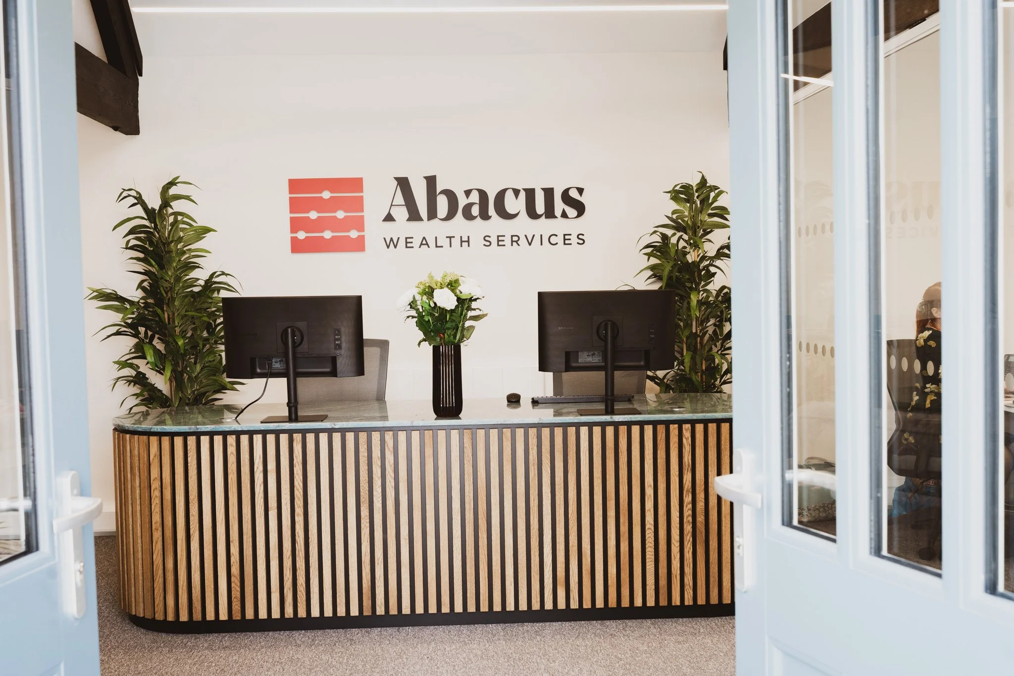
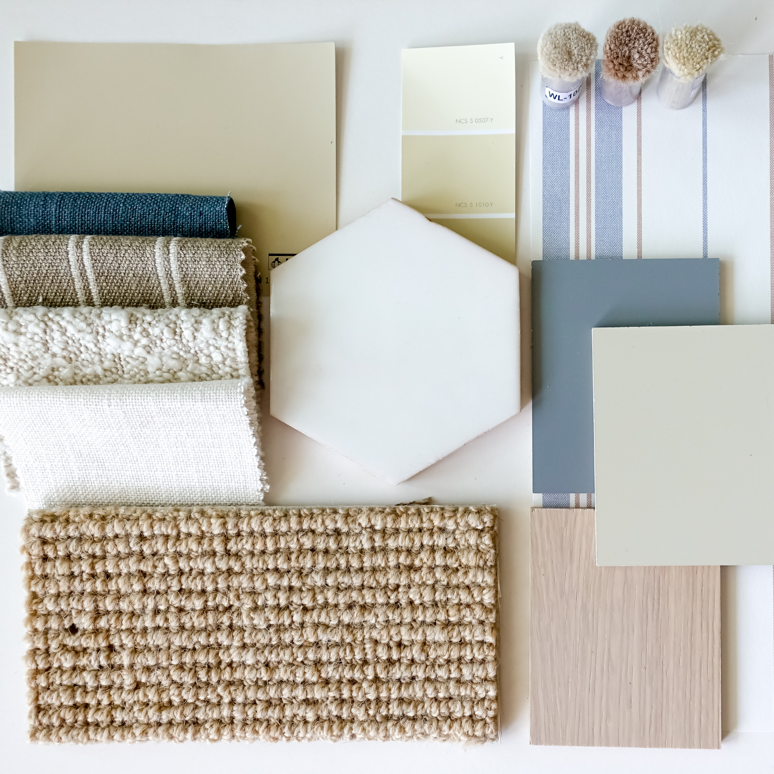
Neutral Tones: The True Foundation of Colour Psychology
Neutrals do more than “balance” a palette, they shape the emotional tone of a space.
White creates clarity, freshness and spaciousness.
Black adds weight, definition and sophistication.
Grey offers calm neutrality and incredible versatility.
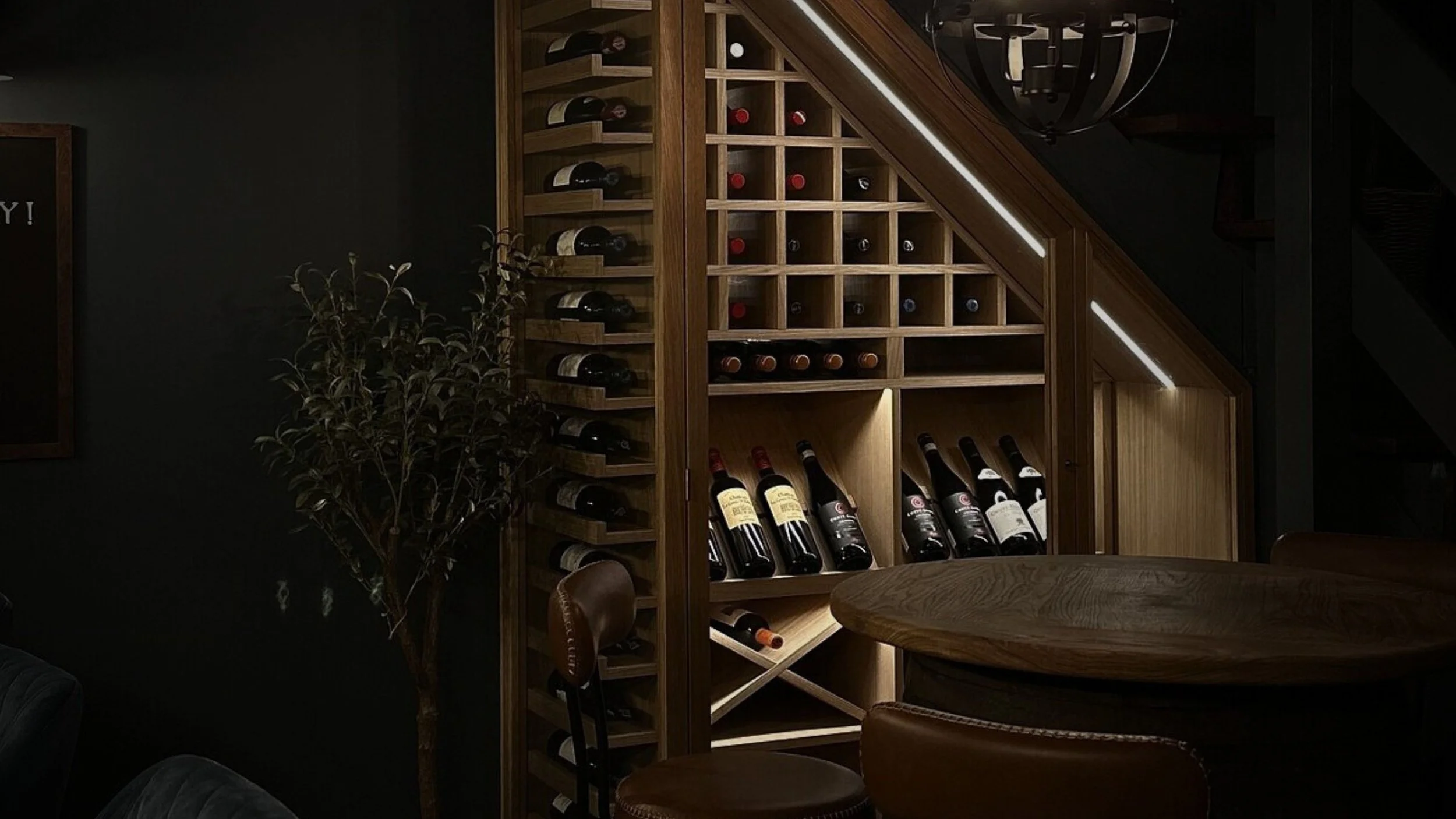
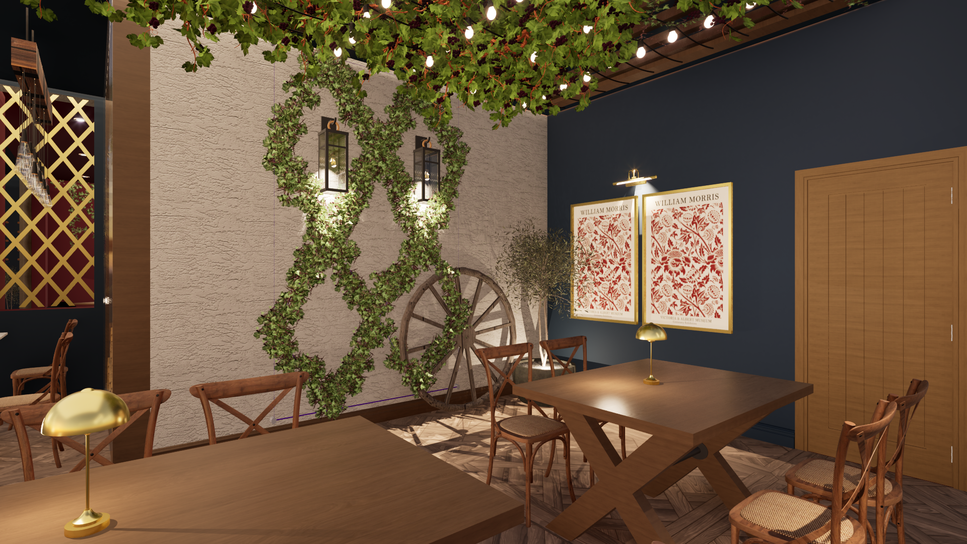
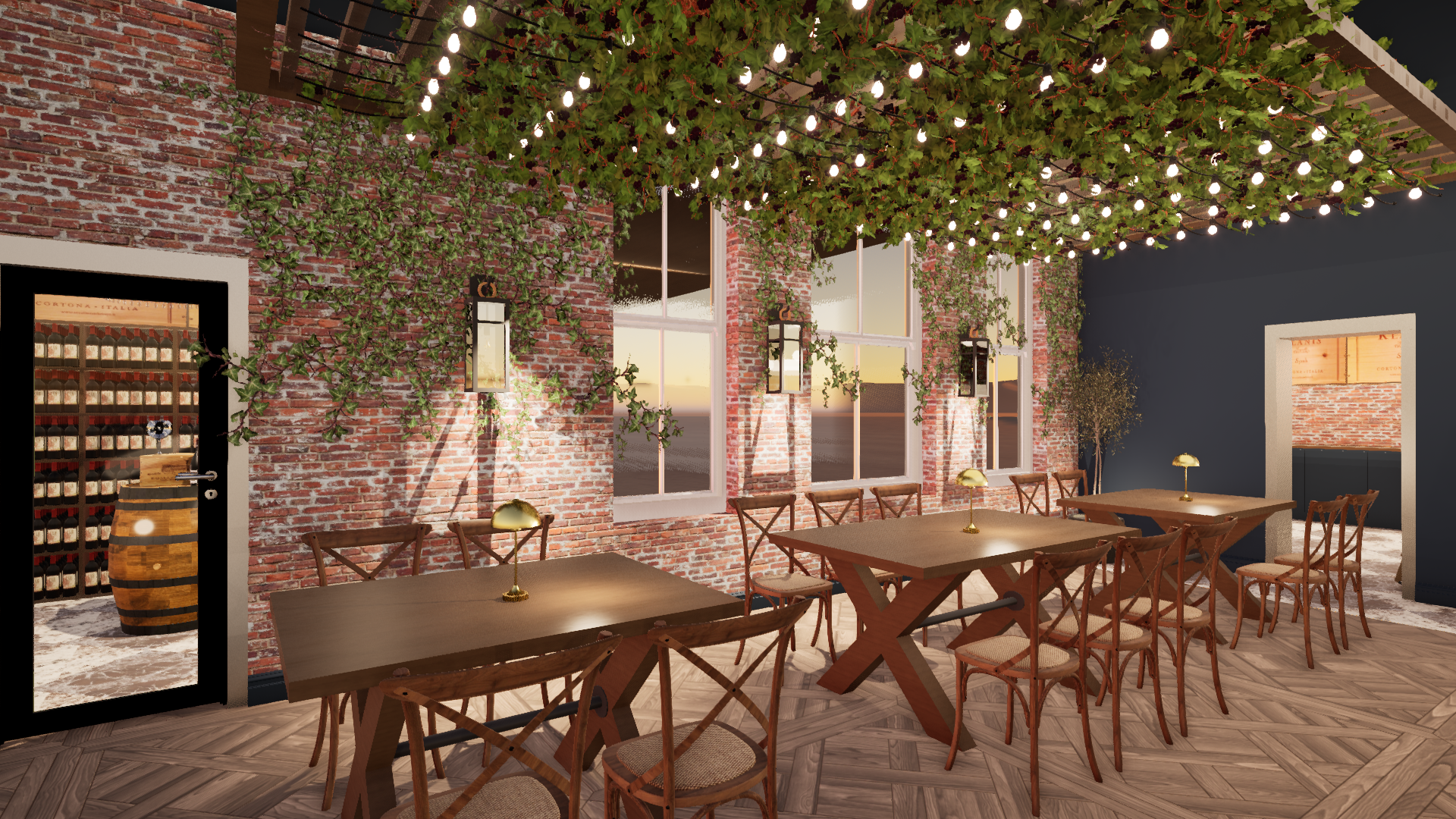
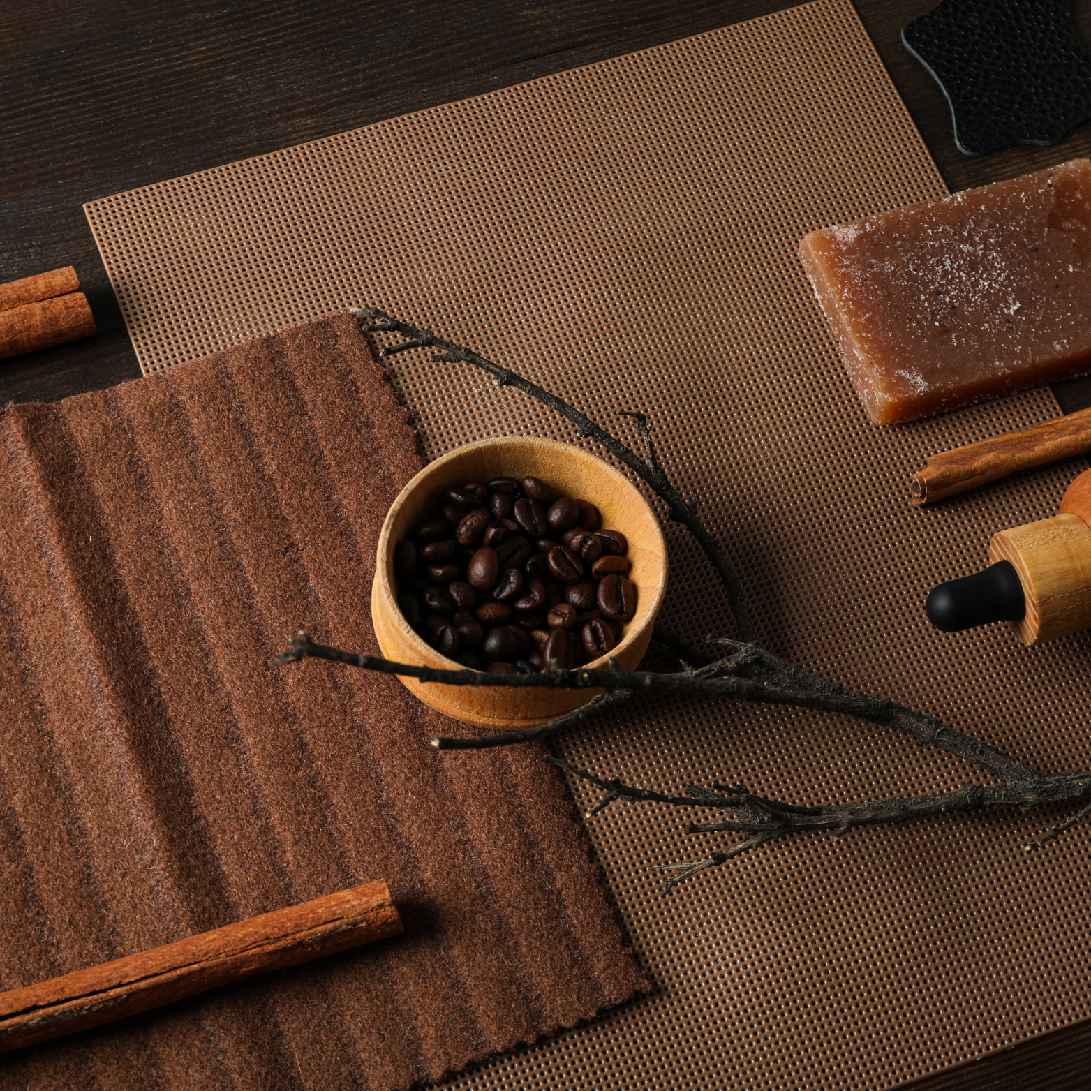
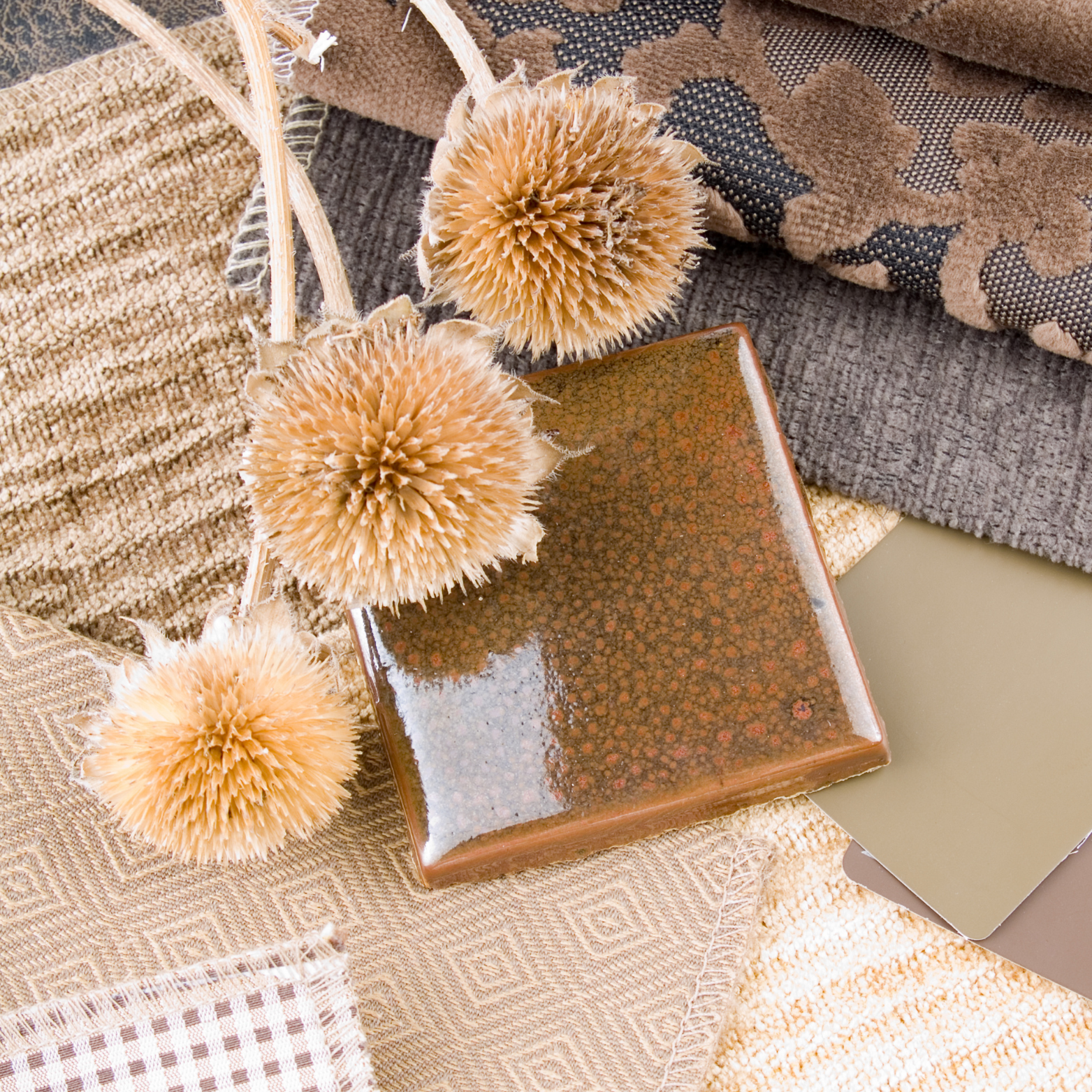
Brown and natural earth tones create warmth, grounding and authenticity.
These tones form the base that allows bolder colours to add meaning rather than chaos.
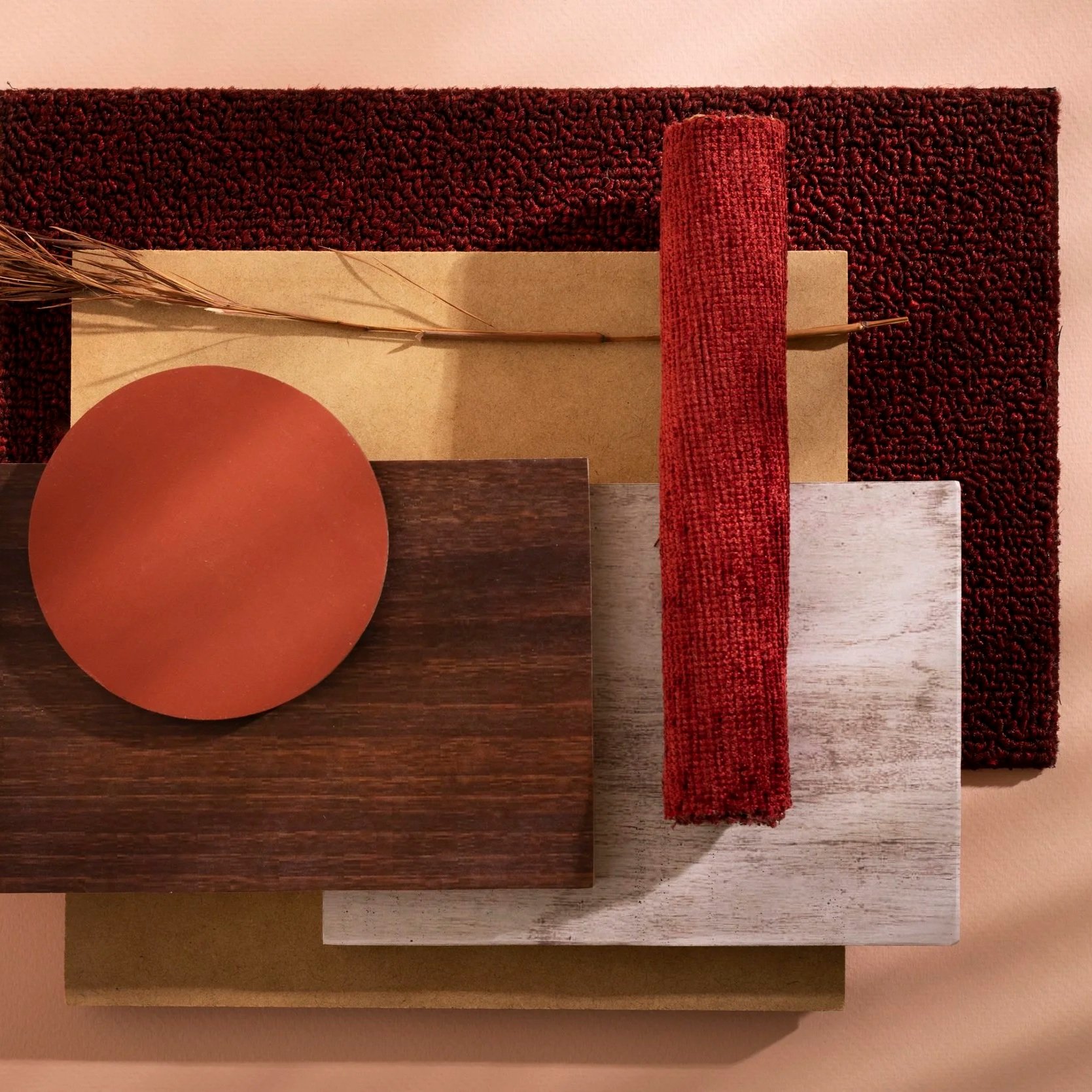
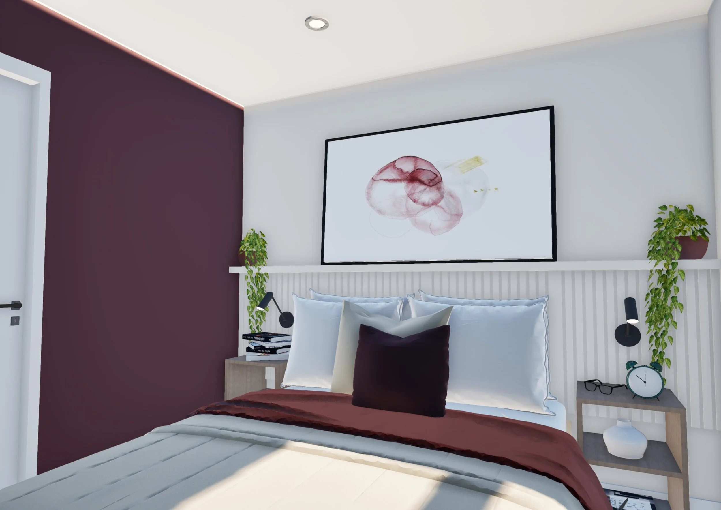
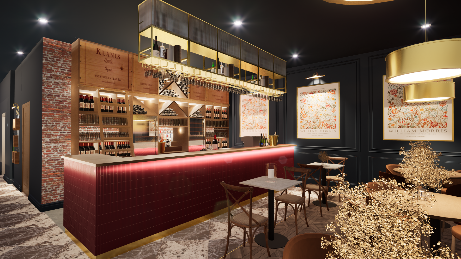
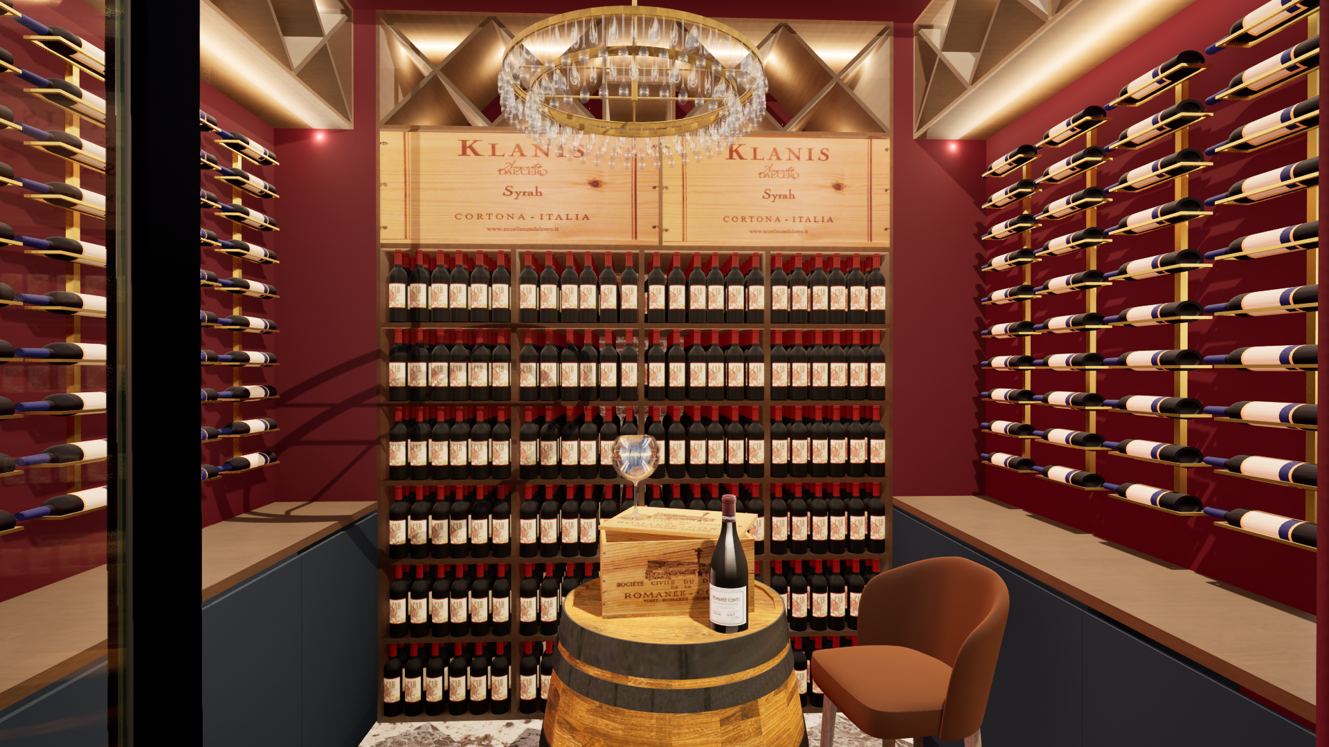
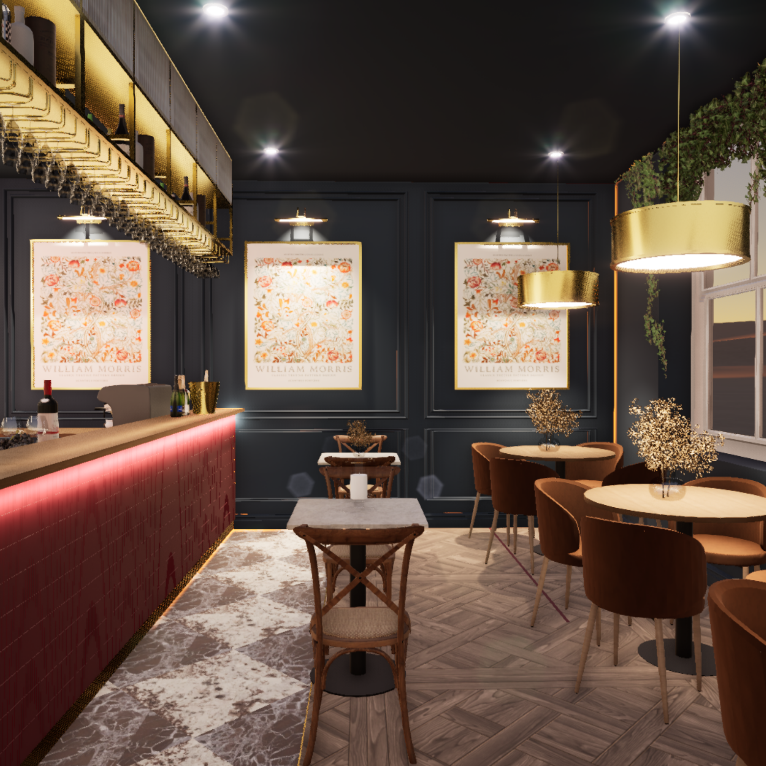
Red:
Energy, Urgency and Stimulation
Bold, dynamic and attention‑grabbing
Increases alertness and encourages action
Ideal for hospitality environments
Best used as an accent to avoid overstimulation
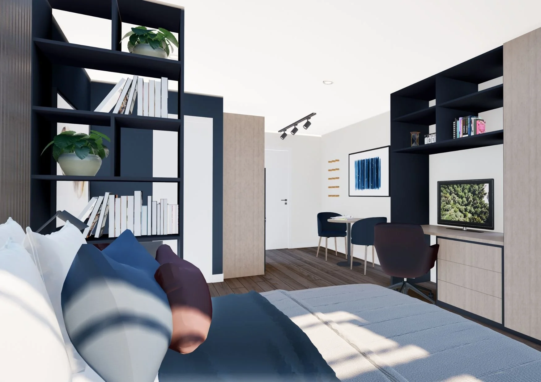
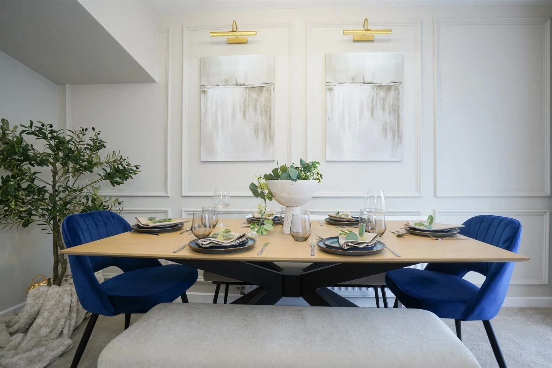
Blue: Calm, Trust and Focus
Associated with stability and professionalism
Supports concentration and clear thinking
Perfect for offices, meeting rooms and corporate spaces
Helps create a calm, productive atmosphere
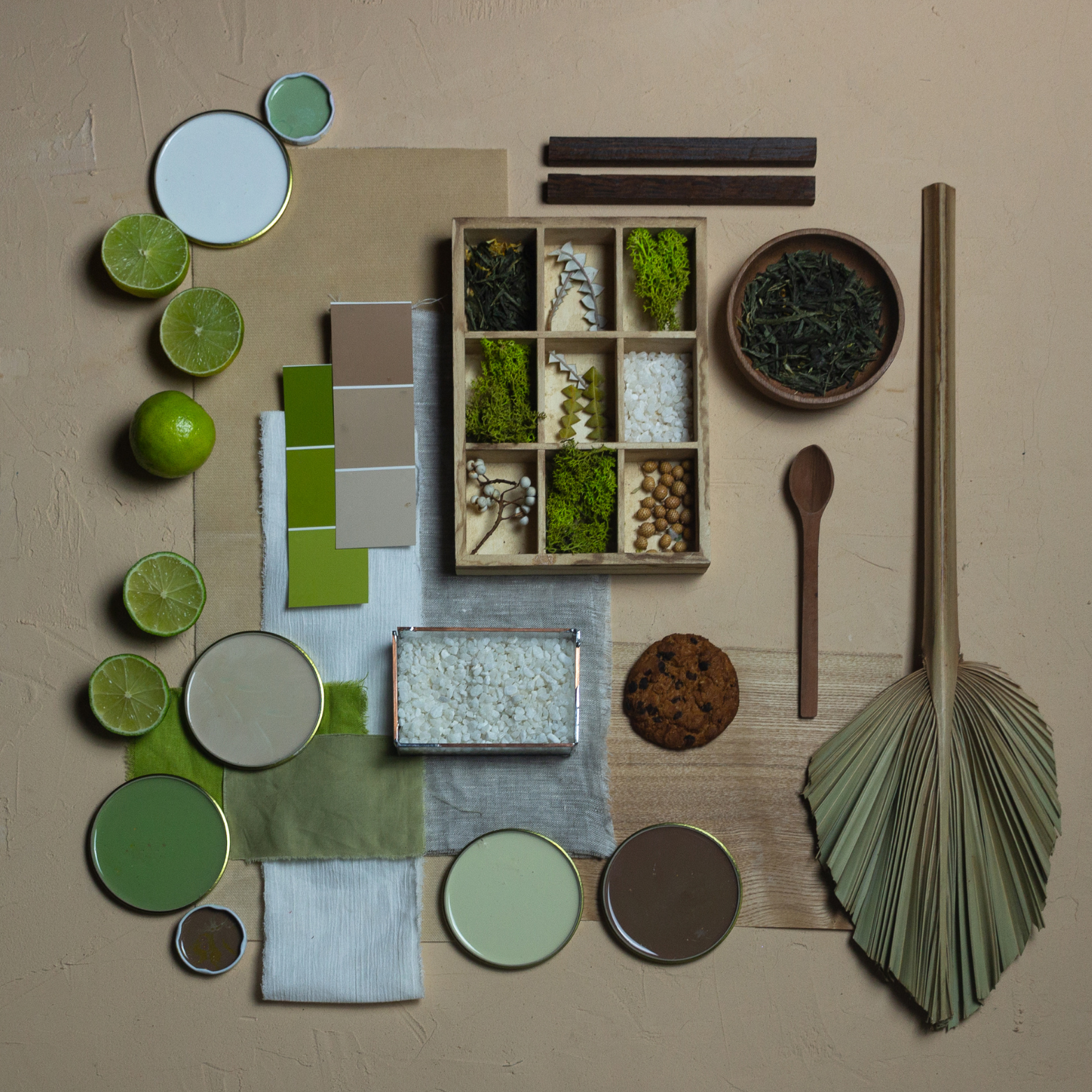
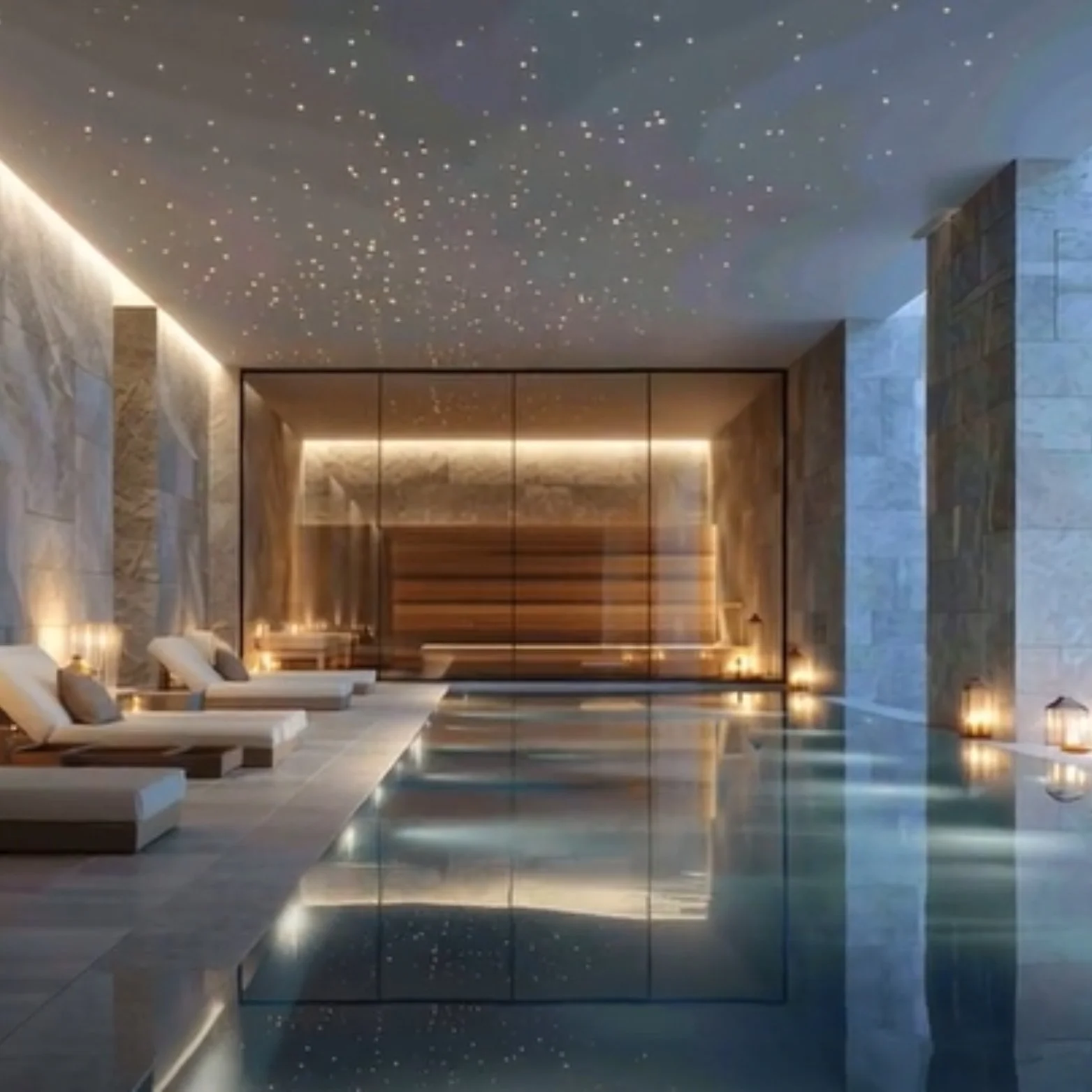
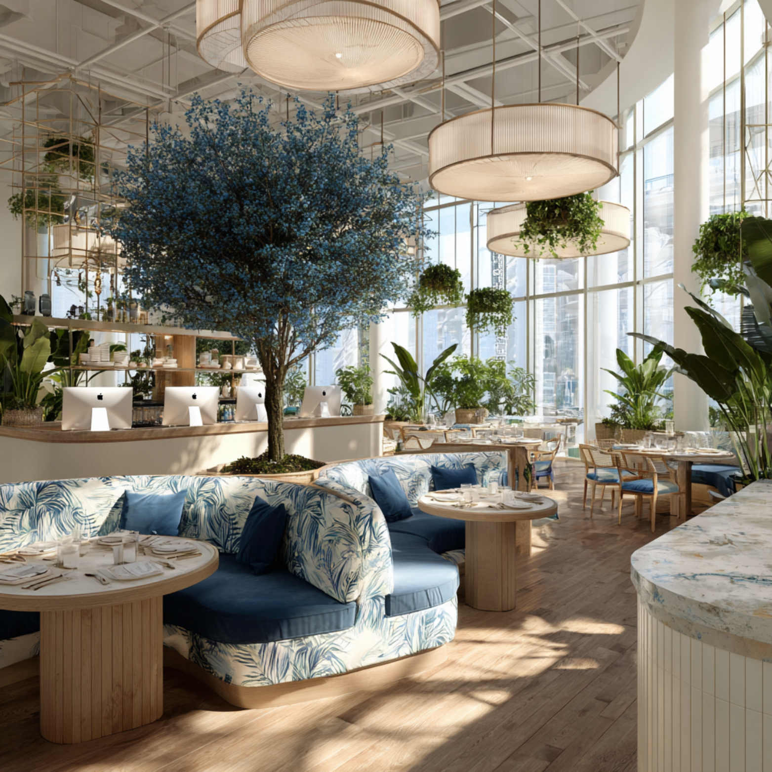
Green: Balance, Nature and Wellbeing
Restorative and grounding
Creates a sense of equilibrium and calm
Works well in workplaces, healthcare and wellness spaces
Reduces stress and supports mental clarity
Yellow: Optimism and Creativity
Sparks energy, positivity and fresh thinking
Ideal for creative studios and collaborative areas
Should be used thoughtfully, as very bright tones can overstimulate
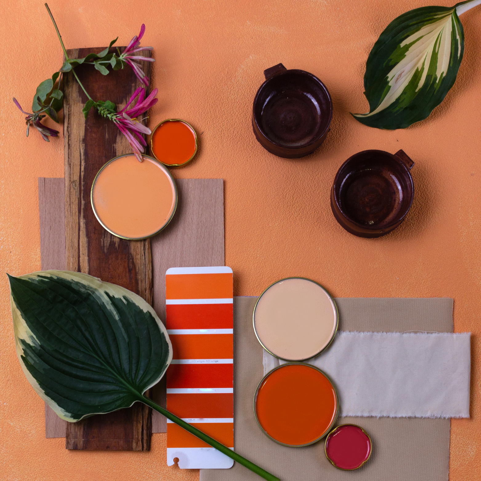
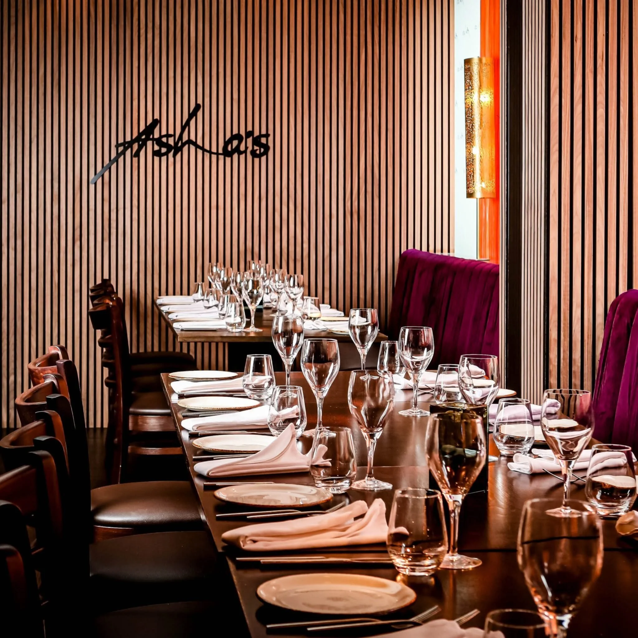
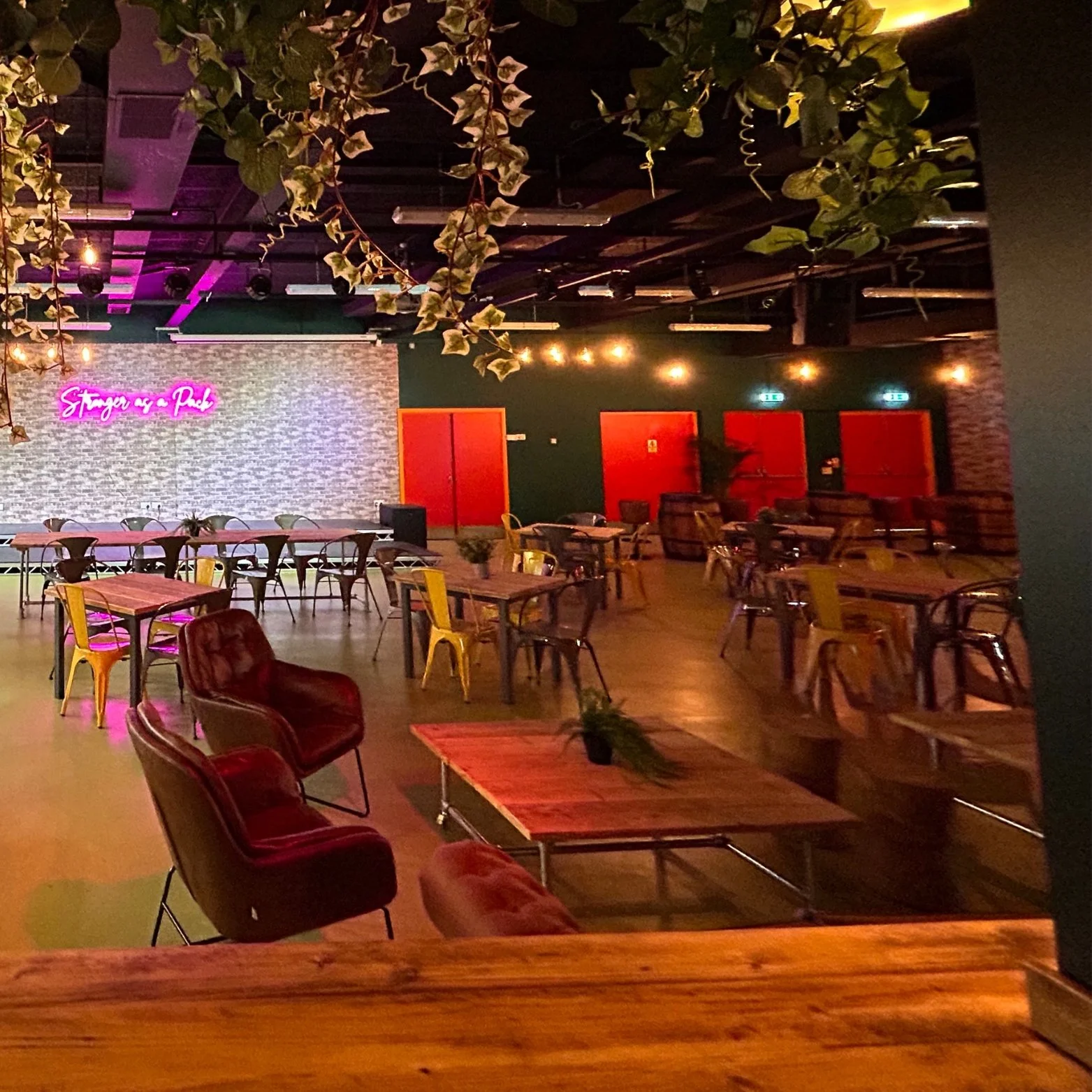
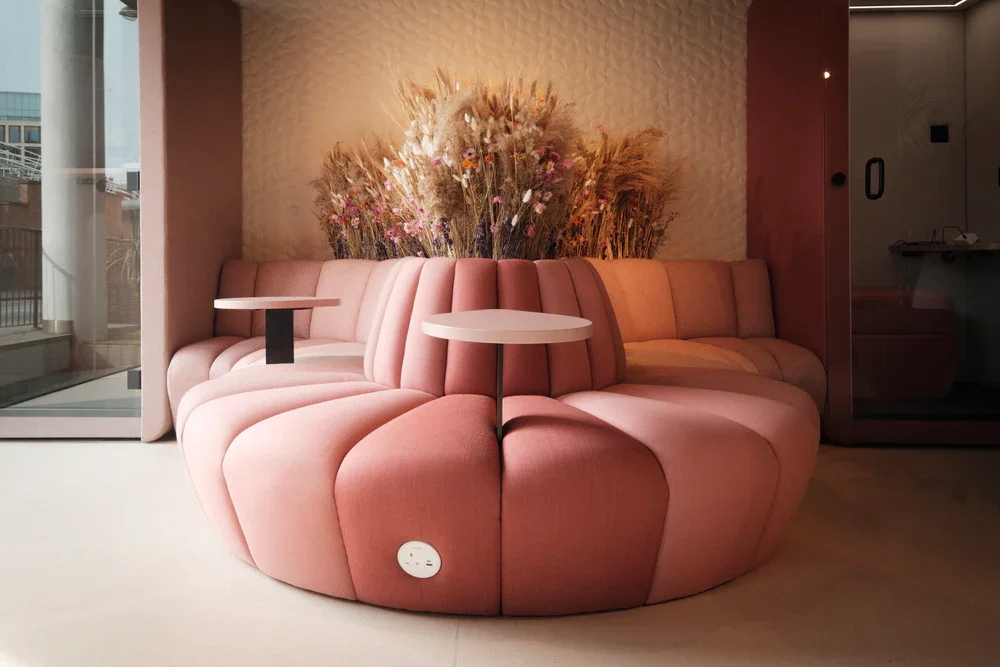
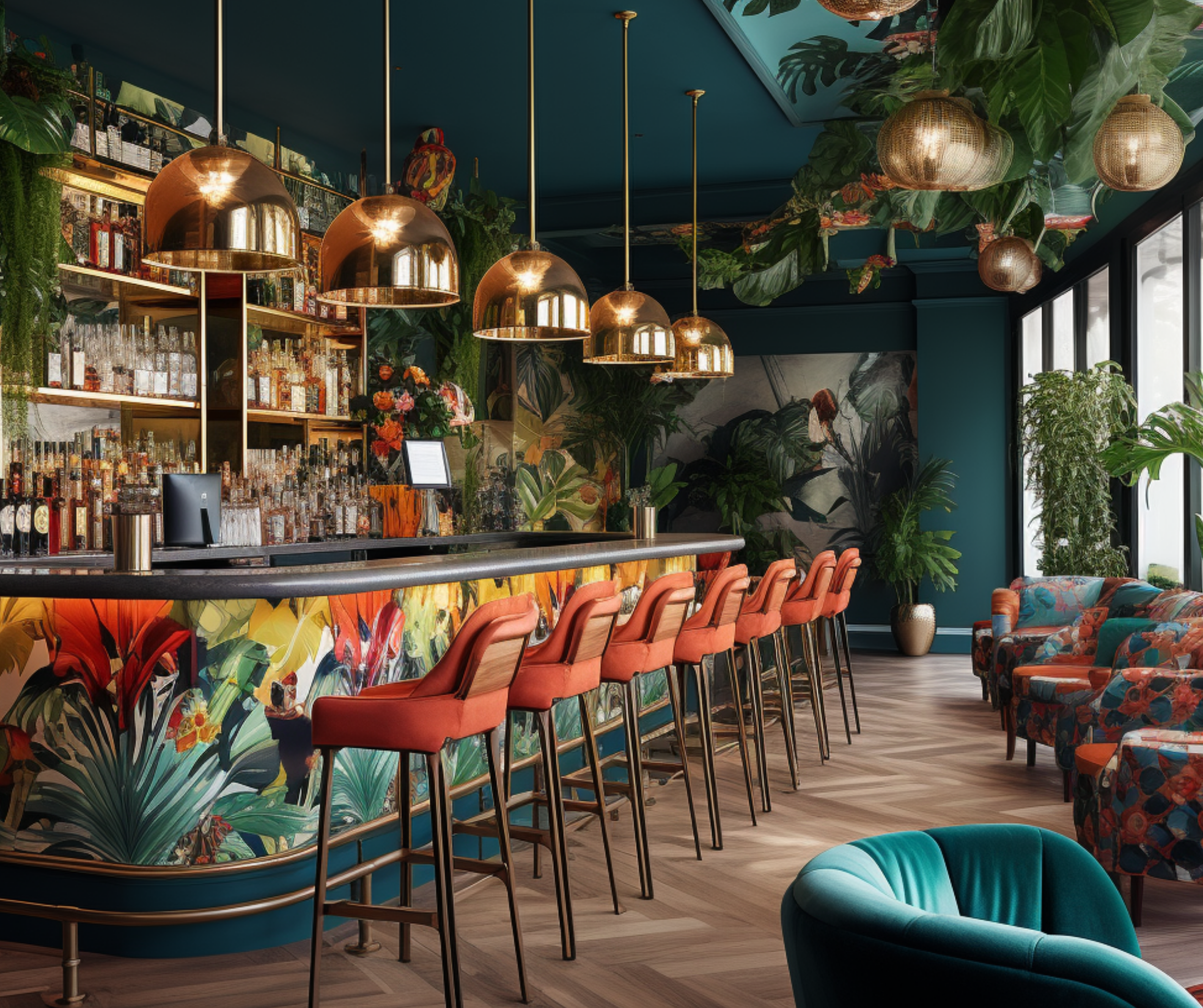
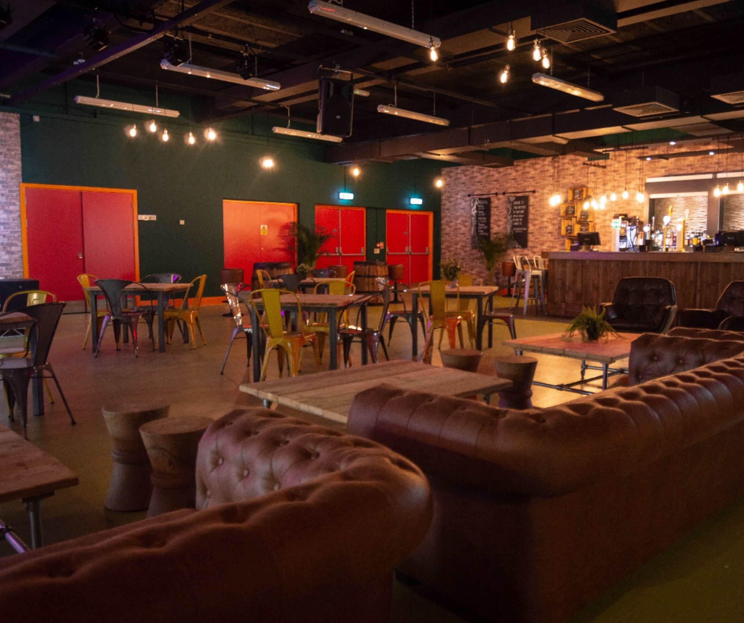
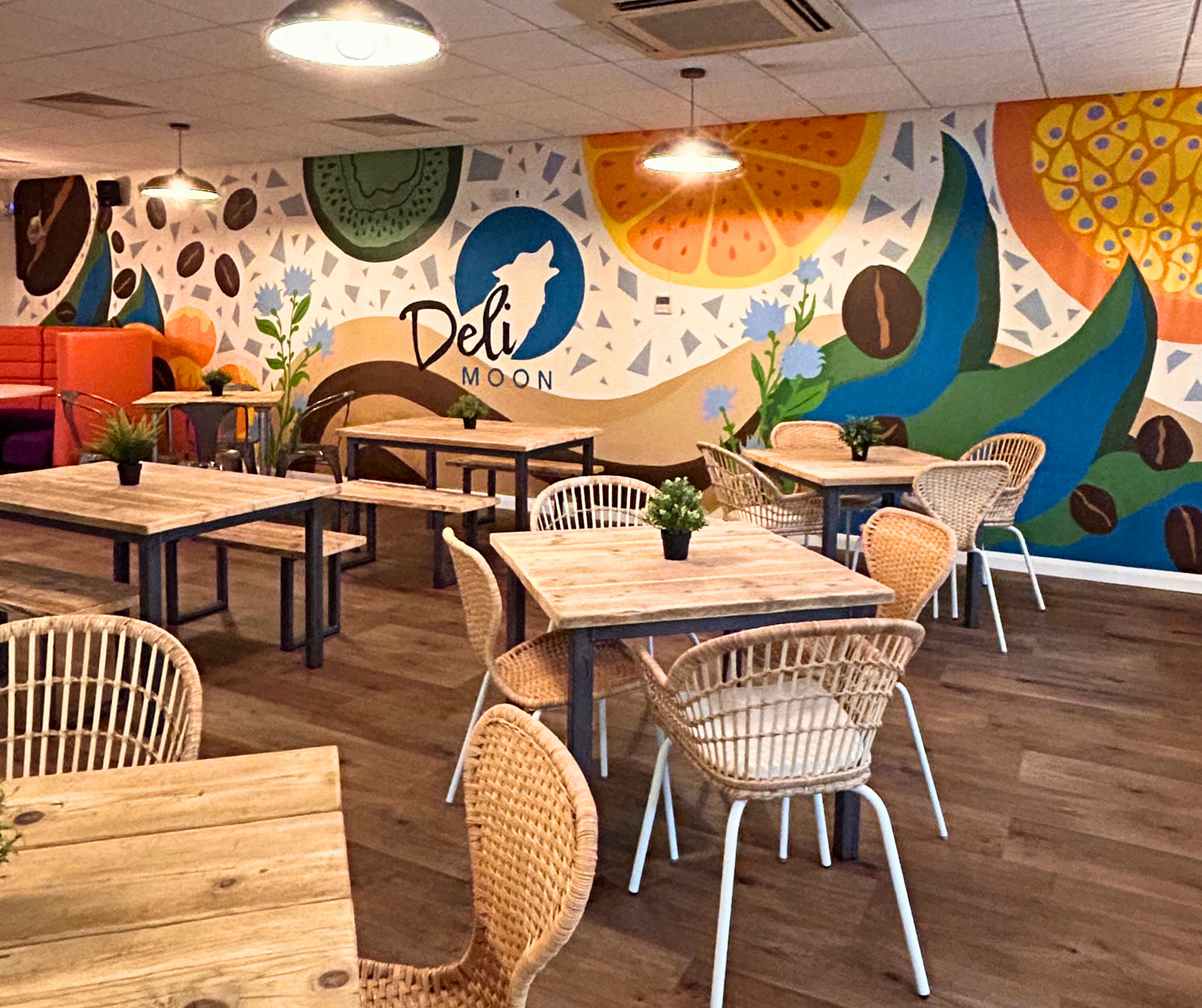
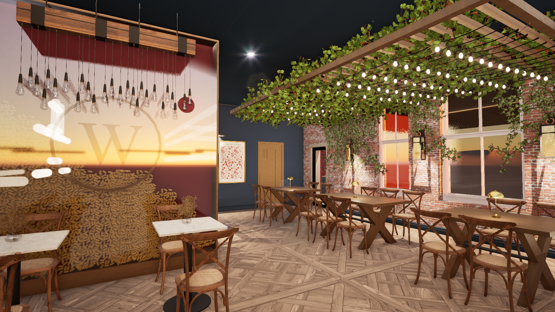
Orange: Warmth and Sociability
Encourages connection, conversation and interaction
Great for cafés, break areas and hospitality spaces
Terracotta and muted oranges add warmth without intensity
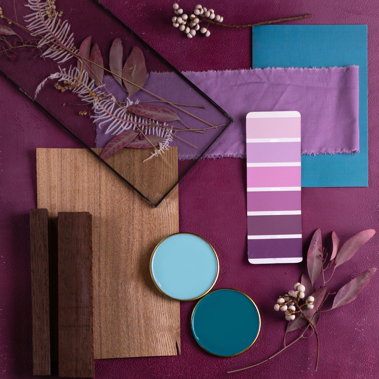
Purple: Luxury, Creativity and Depth
Adds sophistication and emotional richness
Supports creative thinking and reflection
Soft purples create calm; deep tones add drama and elegance
Why Colour Psychology Matters in Commercial Interiors
When used strategically, colour can:
Improve focus and cognitive performance
Reduce stress in high‑pressure environments
Strengthen brand identity
Shape decision‑making and user behaviour
Increase dwell time in hospitality settings
Create workplaces where people feel happier and more connected
Support staff retention and overall wellbeing
Colour isn’t a finishing touch, it’s a behavioral design tool.
Colour as a Strategic Element in Commercial Interiors
Great commercial design doesn’t rely on colour trends, it uses colour intentionally to support the purpose of the space.

1. Aligning colour with brand identity
Your interior should feel like an extension of your brand. Through strategic palettes, feature zones, artwork and materiality, colour can reinforce your values without becoming literal or excessive.
2. Designing for function
Different spaces require different emotional cues:
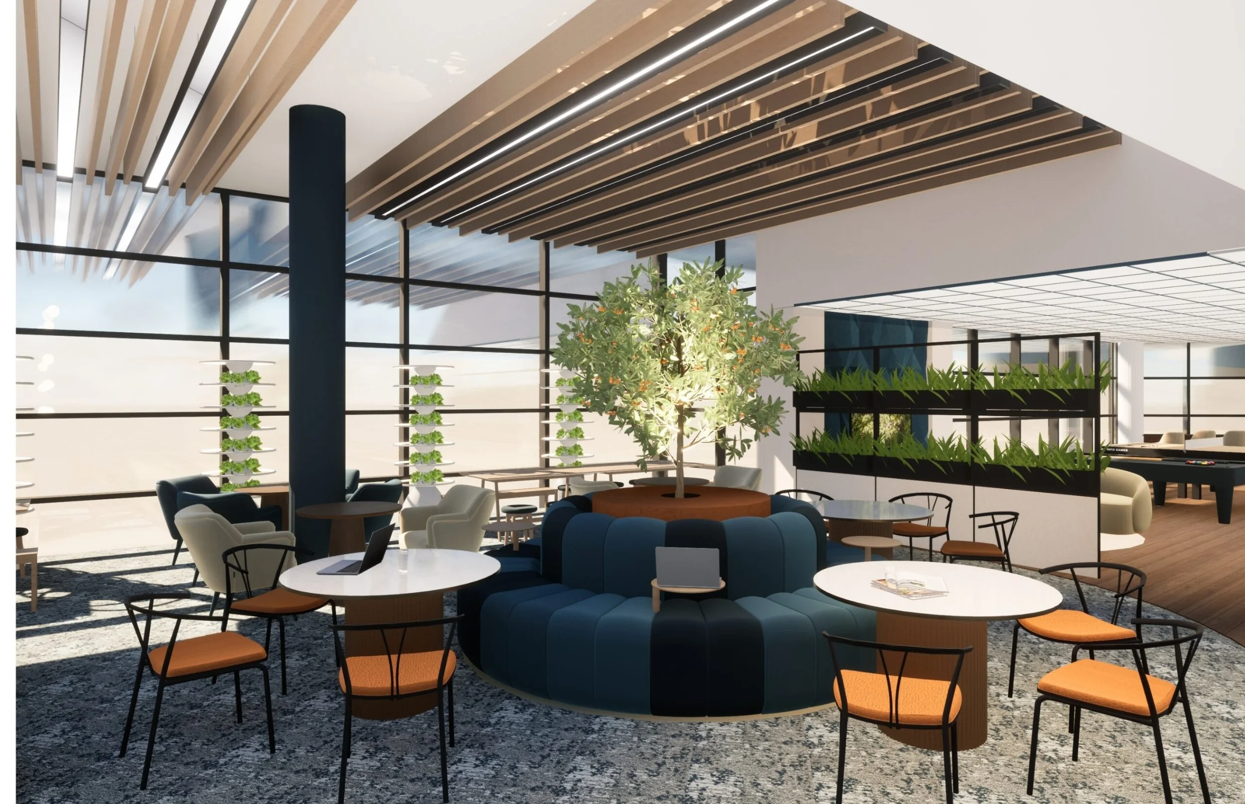
Workplaces: calming neutrals with blue/green accents for focus
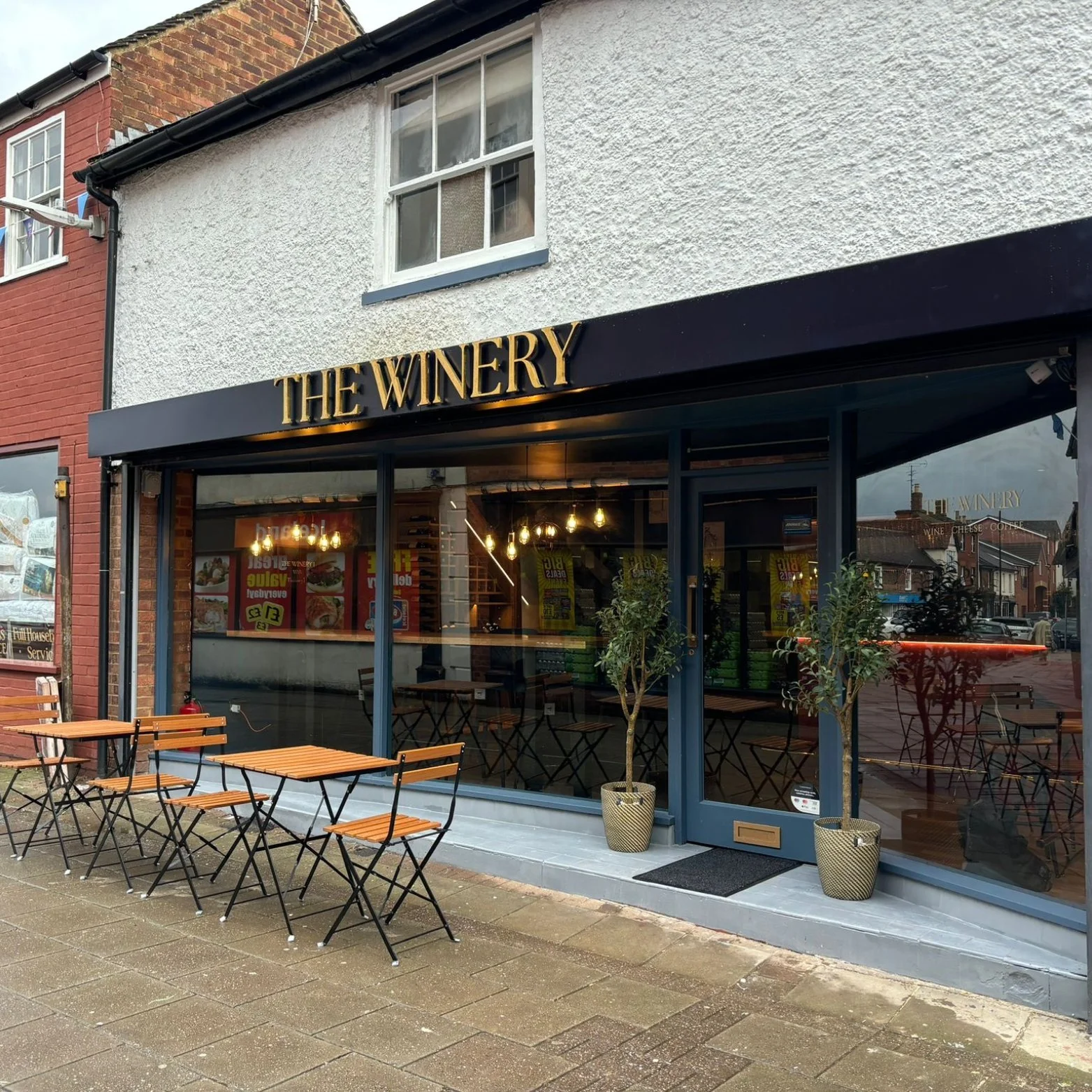
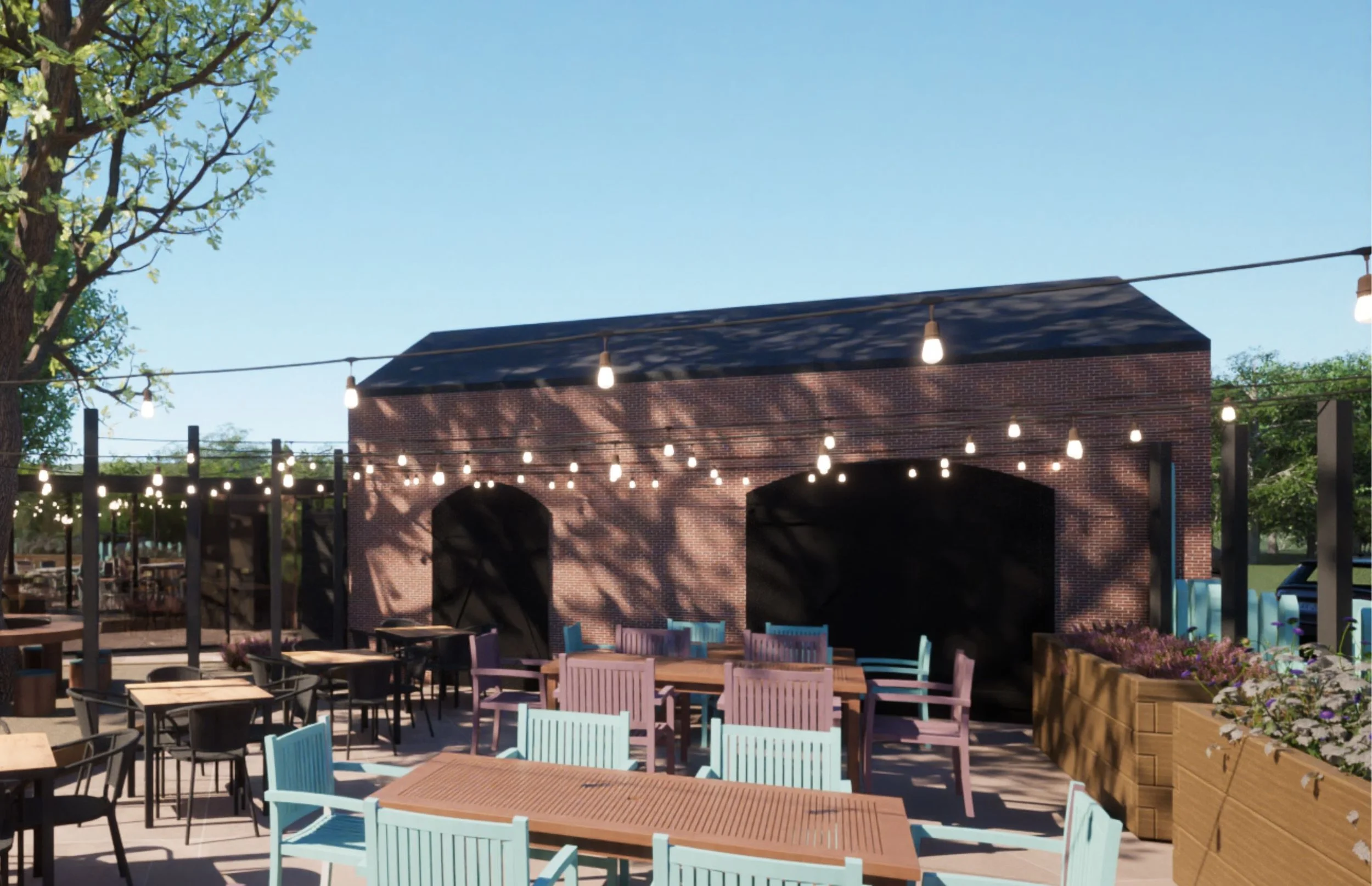
Hospitality: warm tonality for comfort, appetite and sociability
Retail: contrast and vibrancy to encourage exploration
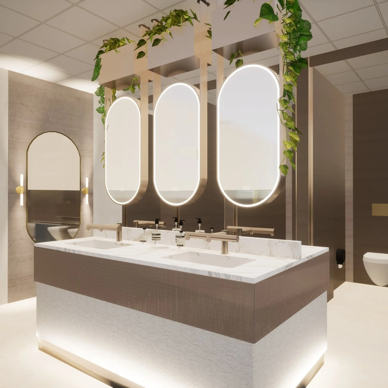
Care environments: soft, restful tones that support wellbeing
Show homes: cohesive palettes that feel aspirational yet livable
Colour becomes a performance tool, supporting the behavior you want to encourage.
3. Crafting harmonious palettes
Colour never exists alone, it shifts dramatically depending on:
Natural light levels
Artificial lighting temperature
Surrounding materials
Textures and finishes
A blue wall under warm lighting may read green; a grey sofa next to timber may feel warmer or cooler depending on undertones. This is why every commercial scheme at Shropshire Studios is tested in context — in real light, against real finishes.
Texture also amplifies colour psychology. Soft fabrics enhance calm; reflective metals add energy; natural woods bring warmth and grounding.
Transforming Spaces Through Colour
At Shropshire Studios, we use colour psychology not as a trend but as a framework for shaping experiences.
Whether we’re designing an office, a golf club, a restaurant or an entire headquarters, every palette is intentional and grounded in research, tailored to the brand and aligned with how people need to feel in the space.